Brand Guidelines
This page defines how the Pit brand is expressed across product, communication, and design.
The Pit brand is built around clarity, structure, and trust. These principles guide decisions across product, communication, and design.
Brand at Pit is not a visual layer or stylistic addition. It is part of the foundation and should be applied consistently wherever Pit is represented.
Strategy
Software is increasingly easy to create, but not always reliable to use. Many products prioritize speed and surface over systems, resulting in tools that fail under real organizational demands.
Pit builds software from intent, with durability as a baseline. We focus on systems that can evolve, scale, and support real work over time.
Pit is built for organizations that need software they can rely on, not software optimized for demos.
Built for real work
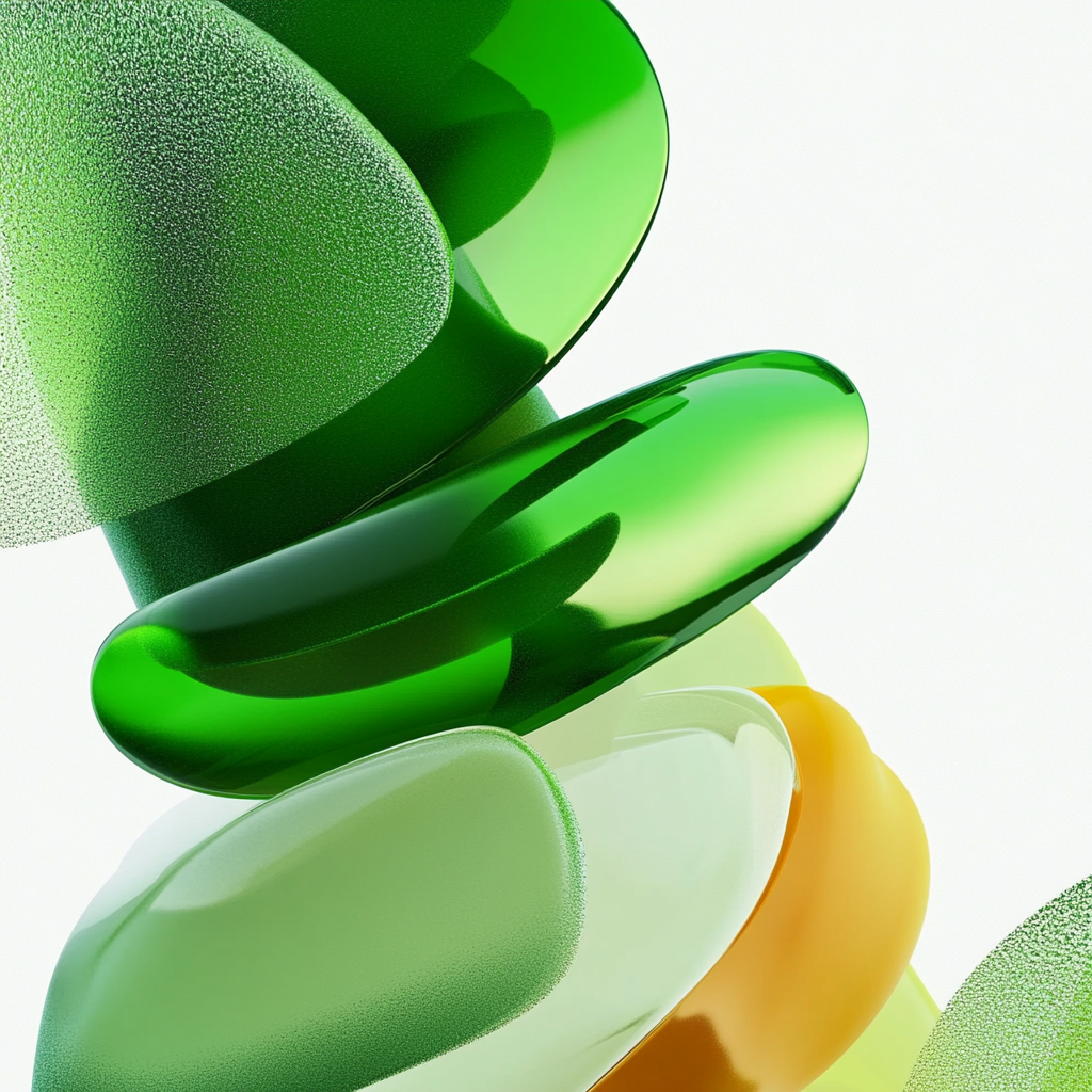
Represents active work in progress during execution and generation.
Personality
Pit’s personality is expressed through how it communicates and behaves, not through slogans or tone alone. The principles below guide decisions across product, language, and design.
Tone of voice
Pit communicates in a clear, direct, and measured way. Language is precise, neutral, and focused on what the user needs to understand or do next.
The tone is calm and confident. It avoids hype, exaggeration, and persuasion. Pit aims to inform, orient, and support decision-making.
Writing should respect the reader’s time. If something can be said more simply, it should be.
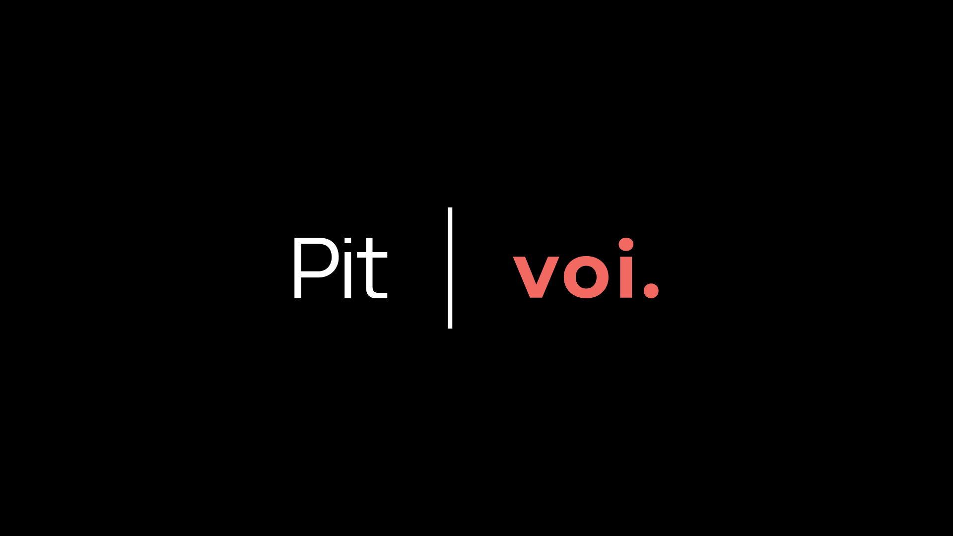
Slogan
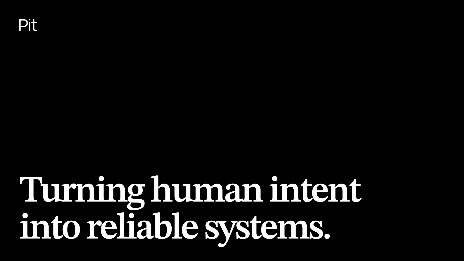
Used sparingly on high-level brand surfaces such as the website, company pages, and presentations.
The system in motion
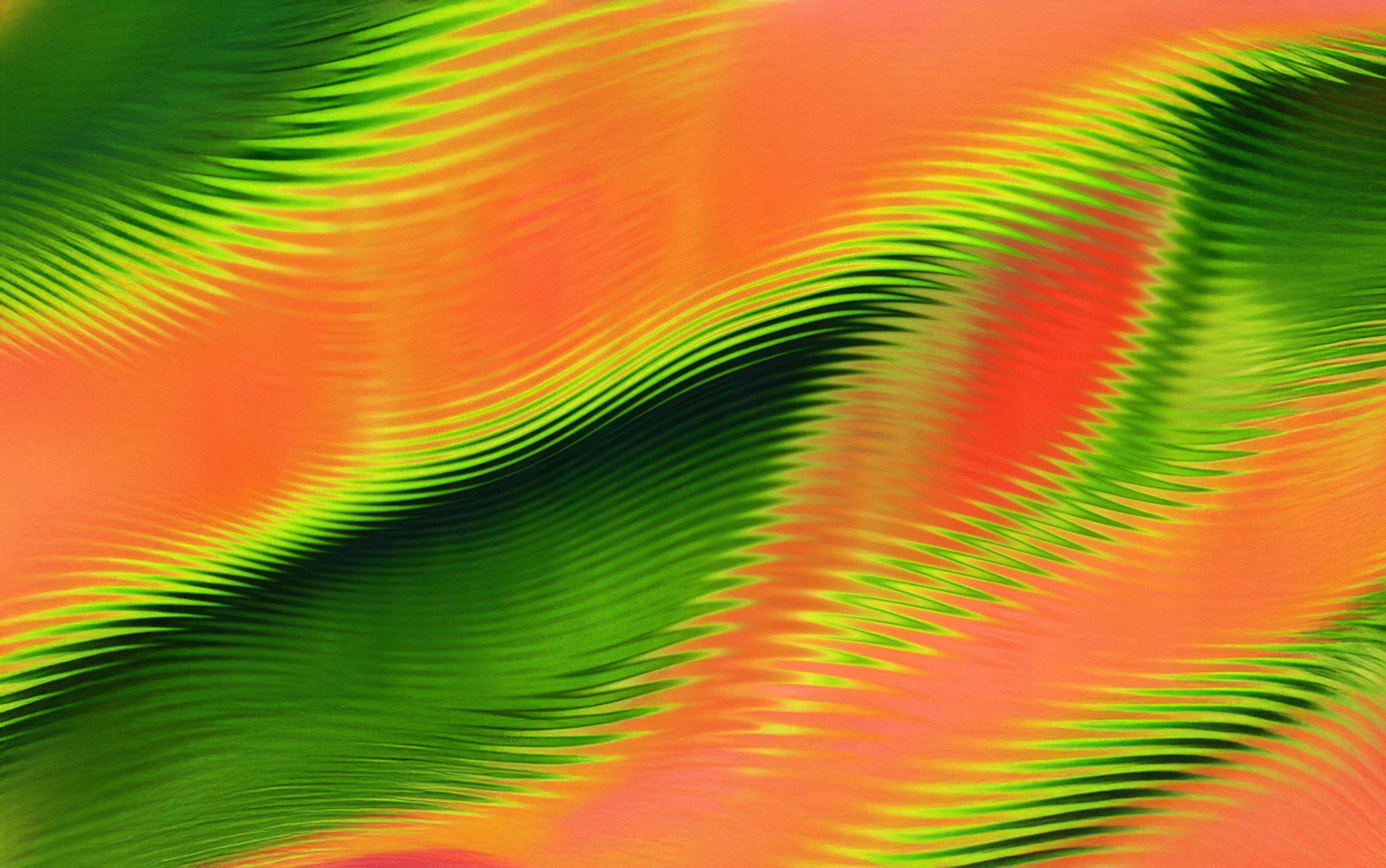
A visual expression of structure, clarity, and control.
Logo
The Pit logo is a wordmark consisting solely of the name “Pit”. It has no symbol, icon, or alternate versions.
The logo must always appear in its original form. It should not be modified, stylized, distorted, or combined into new marks.
In contexts like partnerships or integrations, the logo may appear alongside other brands. In these cases, it should remain visually independent and clearly separated.
The Pit logo

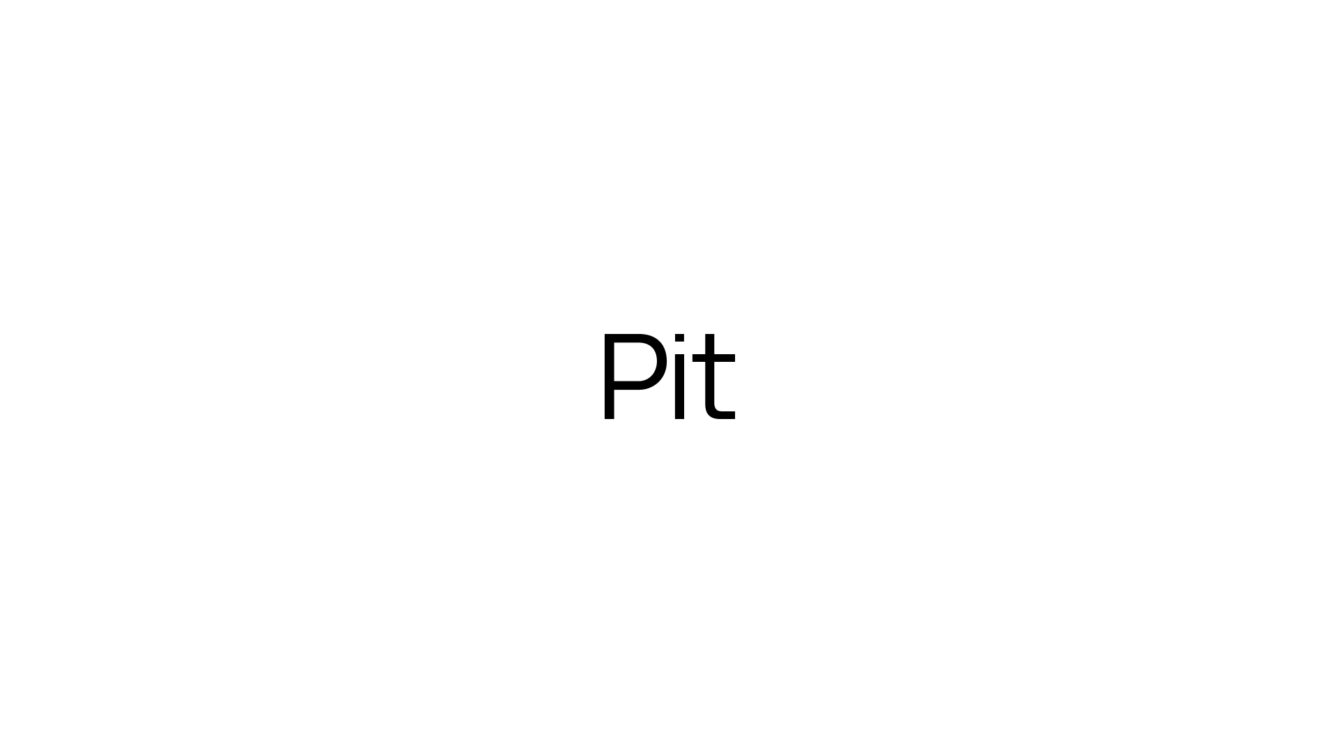
These are the only official expressions of the Pit logo.
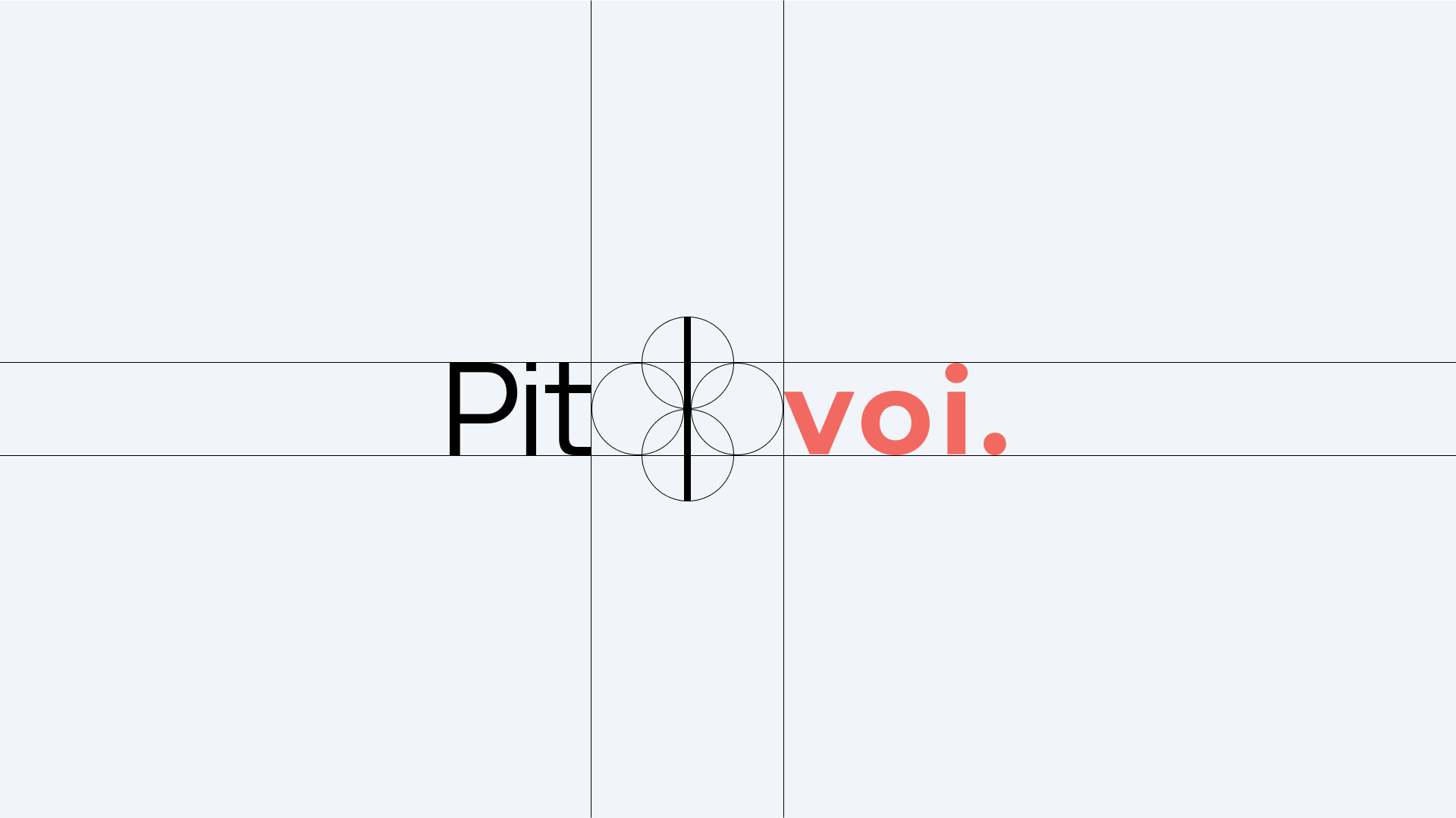
Clearspace
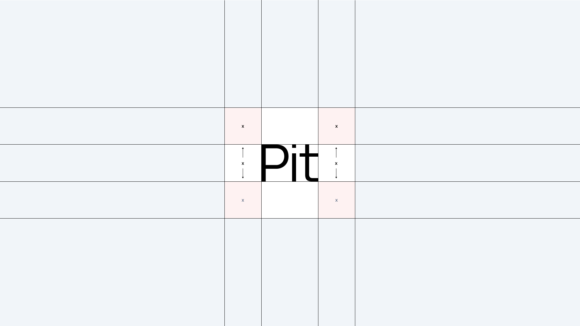
Always maintain sufficient clearspace around the logo to ensure clarity and legibility.
No other elements should enter this space.
Incorrect usage
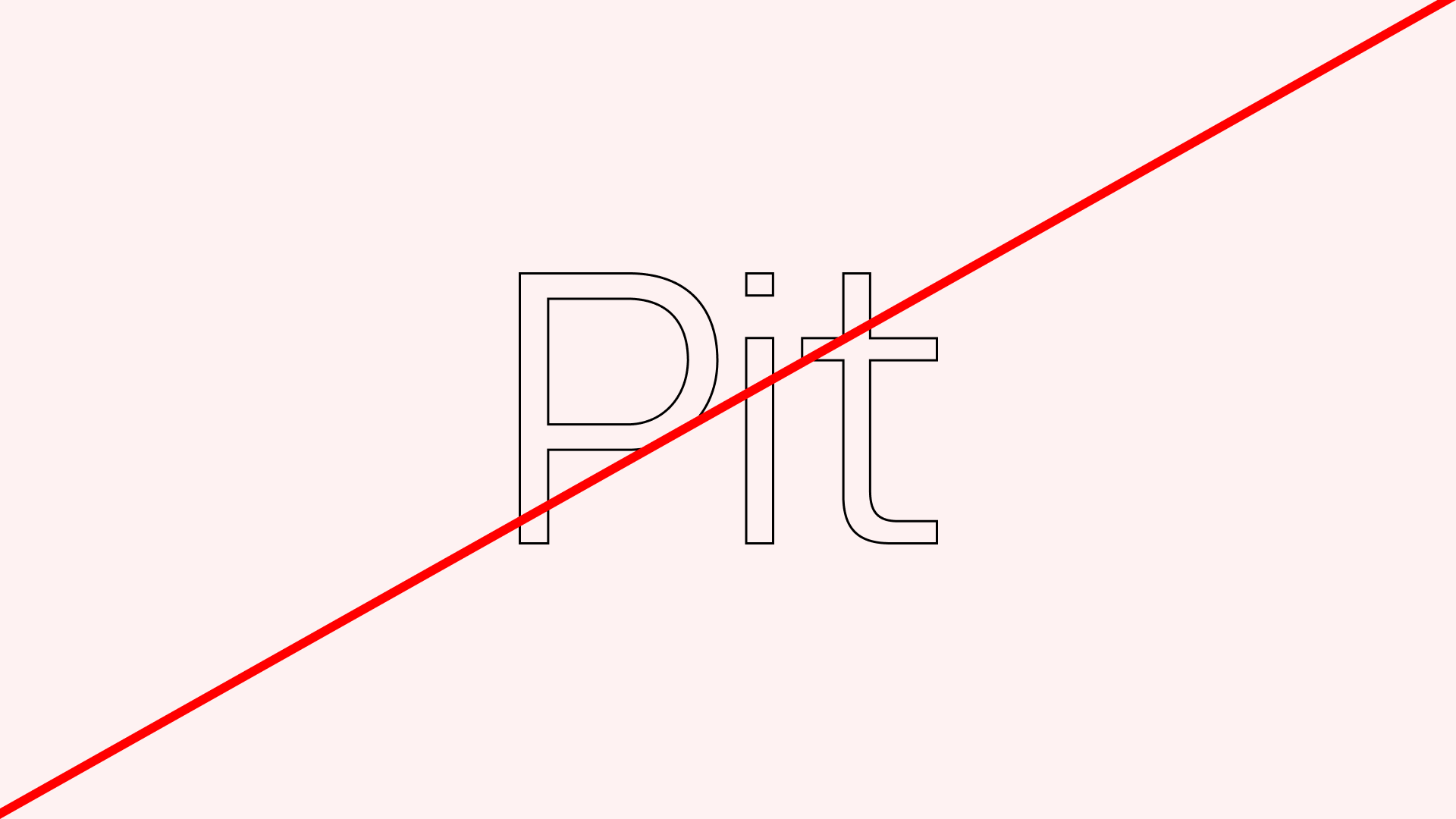

Do not outline the logo
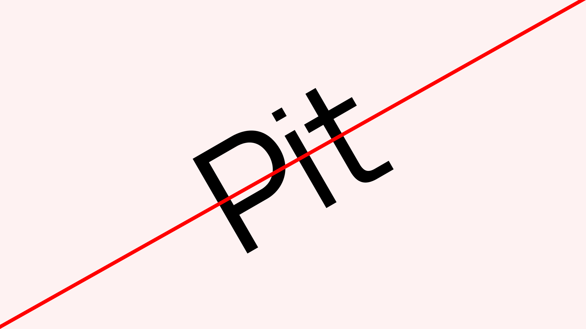
Do not rotate the logo
Do not add gradients the logo
Partnerships
When displayed alongside partner logos, the Pit logo should appear with equal visual weight and sufficient spacing. The logo should not be modified to match partner branding.
Color
Pit uses a strictly minimal color approach and is expressed exclusively in black and white.
For interface construction, Pit relies on a neutral system color set provided by its underlying design system, built on ShadCN and Tailwind. This system includes built-in support for light and dark modes.
System colors are not brand colors and should not be used for brand expression.
During onboarding within Pit Studio, customer brand colors may be applied within the product without changing the Pit brand identity.
Primary colors
Black
Hex: #000000
White
Hex: #FFFFFF
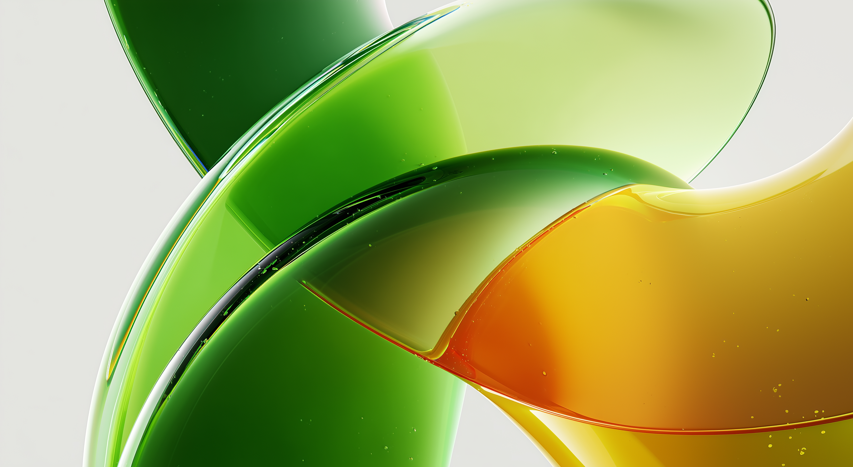
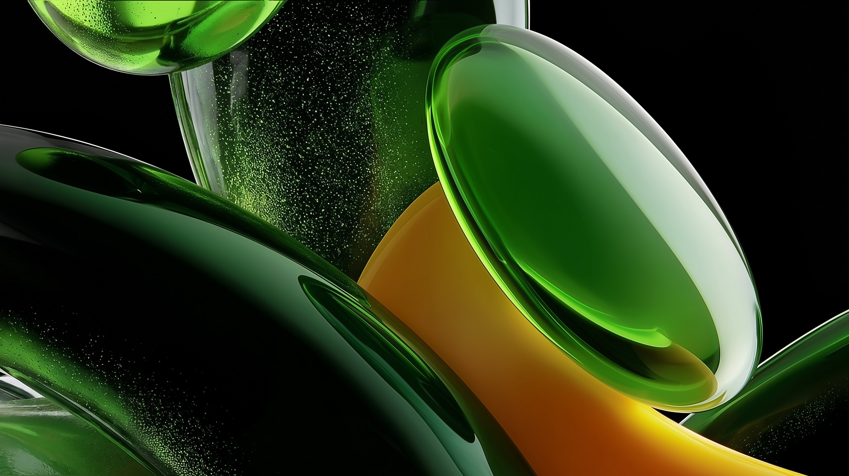
Accent color
Pit Green
Hex: #72FF66
Tap to reveal

Pit Green is a functional accent used to signal activity, progression, and moments of change. It highlights system states and key transitions, without replacing the core black-and-white foundation.
Typography
Typography in Pit is used to guide attention and thinking.
Inter is the default typeface across the product. It is used for all interface text, body copy, labels, and dense information. It supports scanning, efficiency, and predictable interaction.
STIX Two Text is used selectively to slow the user down. It appears in moments where Pit asks users to think, reflect, or make decisions. This includes key questions, prompts, and high-level statements.
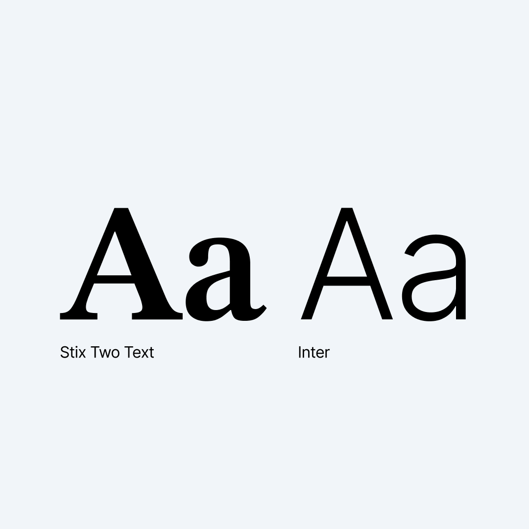
The difference is intentional. Inter supports doing & STIX Two Text supports thinking.
Typography choices in Pit are driven by cognitive role, not by surface or channel.
Sizing, spacing, and hierarchy are defined by the underlying design system and component library, built on ShadCN and Tailwind.

Download kit

Contact us
Back to the top

© Pit
All rights reserved
